Loadhaul
What began as a brief to paint over the old logo on freight locomotives became a major branding exercise across the UK. With the privatisation of Railfreight into competing businesses, we asked the client what they wanted to achieve with their rebrand, and they told us they wanted to be distinctly different from their competitors and ‘unlike anything seen before’. House delivered, with vehicle livery, signage and uniforms, all of which became part of an entirely new, bold identity. It was so enthusiastically embraced by the staff family, that one couple got married in the corporate colours. The bride wore orange!
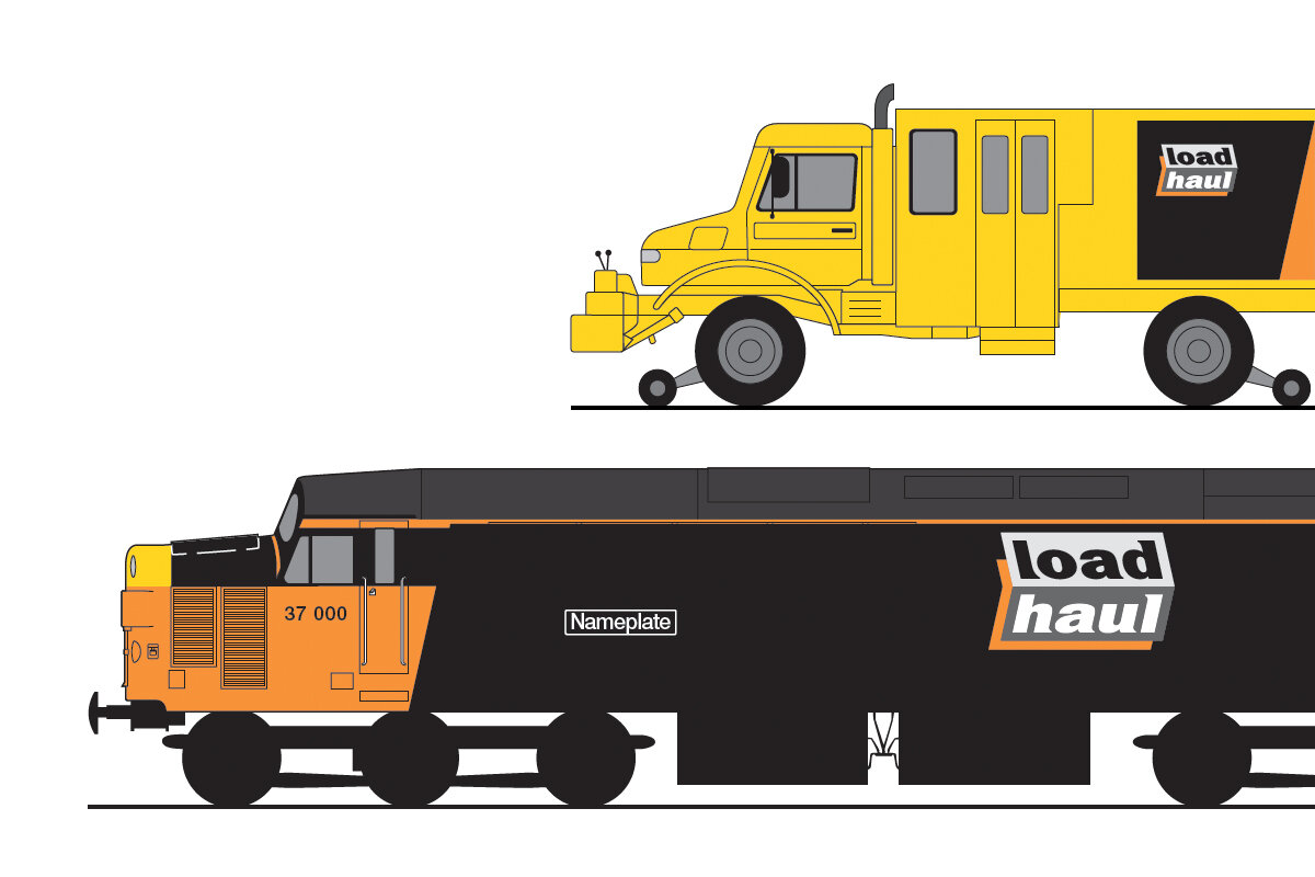

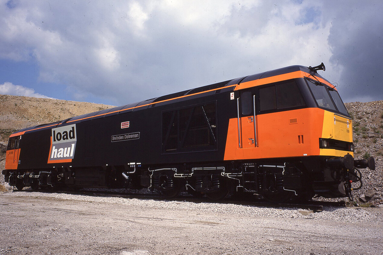
Runaway winner in our poll for liveries was the bold black and orange of Loadhaul, it’s the sheer popularity of Loadhaul amongst both enthusiasts and staff.....is there any other better livery ever than Loadhaul?
Rail press readers’ poll
Creative partner: Chris Bennett